Front & York

In-Construction
The story of Front and York isn’t one full of characters. That is to say it isn’t a building with a legible linear storyline manifest in its expression. To be sure, Front & York is rising out of a linear production history as any project might; but reading its history is difficult. In that way, the design prioritizes form and product over function or process. The design is intended to exist at cascading scales of detail. There are elements that rely on one another for balance and moves that loosely respond to one another in sequence but each level of expression exists in some sense on its own. Each “move” refers only to itself and without much overlap with the other moves.
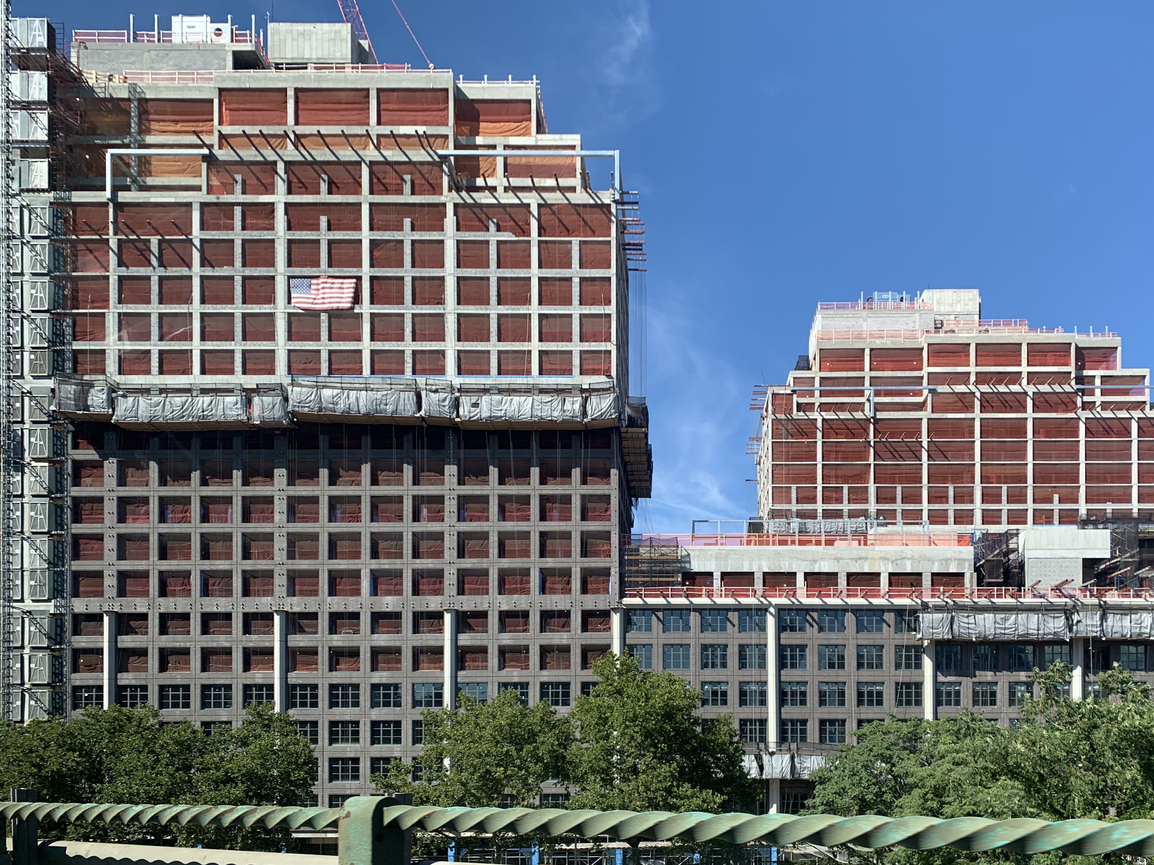
The project is a single-building, full-block development of 1.1 million square feet in Dumbo. The residential portion of the project, containing 723 units, rises as a solid stone hewn from the pressures of the neighborhood’s current conditions and past life. This mass is set upon a rigorous system of arches relating to the domineering infrastructure that Dumbo is placed beneath. The draw to this neighborhood is its position in the city and the rugged character of its history. Today Dumbo is painfully trendy with private clubs, luxury retail and high-end restaurants strewn about.
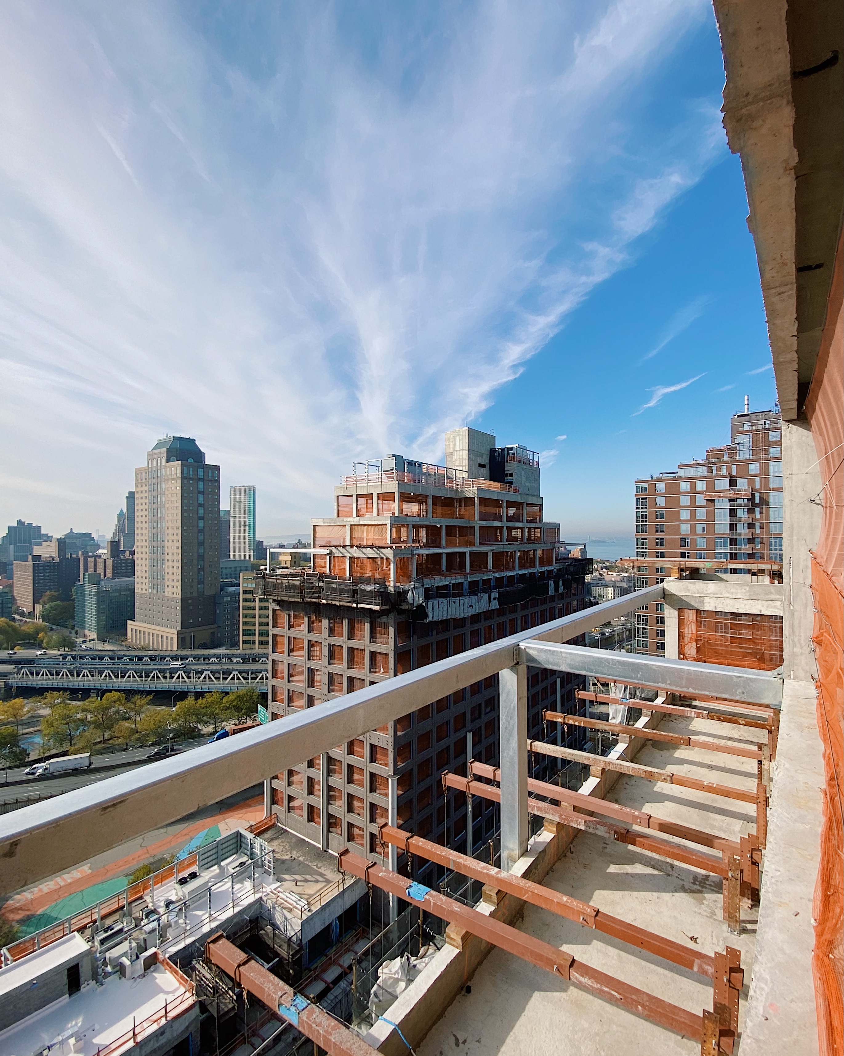
Front & York was begun as an invited competition pitting MA against ODA New York, Bjarke Ingels Group, and S9 Architecture. When as MA was awarded the project, we were told that the project would not be proceeding as two towers on a podium, as it was presented in our competition entry, but we ended up doing that anyway. The following pages show our two towers on a podium as it nears the finish line of construction.
Over the last 4 years, I have worked as part of a core team of architects and designers on this project starting near the very beginning. I have been engaged in every aspect: design, detailing, documentation, coordination, and construction administration. Though the project is not located in the Dumbo Historic District, the brief required a building that stood out by fitting in, something Morris Adjmi is known for.
The project rises from a former parking lot with confidence; not because of internal pressures, but because of external ones. Contemporary Dumbo exists at the intersection of luxury and grit. Sandwiched between the Navy Yard and Brooklyn Heights along the East River, the site demanded a furthering of the thick, urban fabric. The evidence of industry that once characterized the use of the neighborhood is slowly being ironed out in the style of Chelsea’s Meatpacking district on the West side of Lower Manhattan. Inlaid train tracks in rough cobblestone streets are being replaced with much easier to walk on brick paving.
This wave of development has moved East from the origins of this neighborhood’s redevelopment found at Brooklyn Bridge Park.
Immediately adjacent to the site - at a slightly higher elevation - is a very busy subway station for the F train. It is the center of a rebuild that will meet the demand of the traffic that clambers up its single staircase every day. The pedestrians will spill down the hill from the station towards the primary intersection at Jay and York at a relatively flat Elevation 0’. Across the site, the sidewalk slopes 25’ feet total.
The following pages explain how the project is a collection of responses to varying scales of force. I have split them into large and small scales.
Large Scale Moves: A series of large scale moves put the project in relation to the soaring infrastructural elements just blocks away and the city at large:
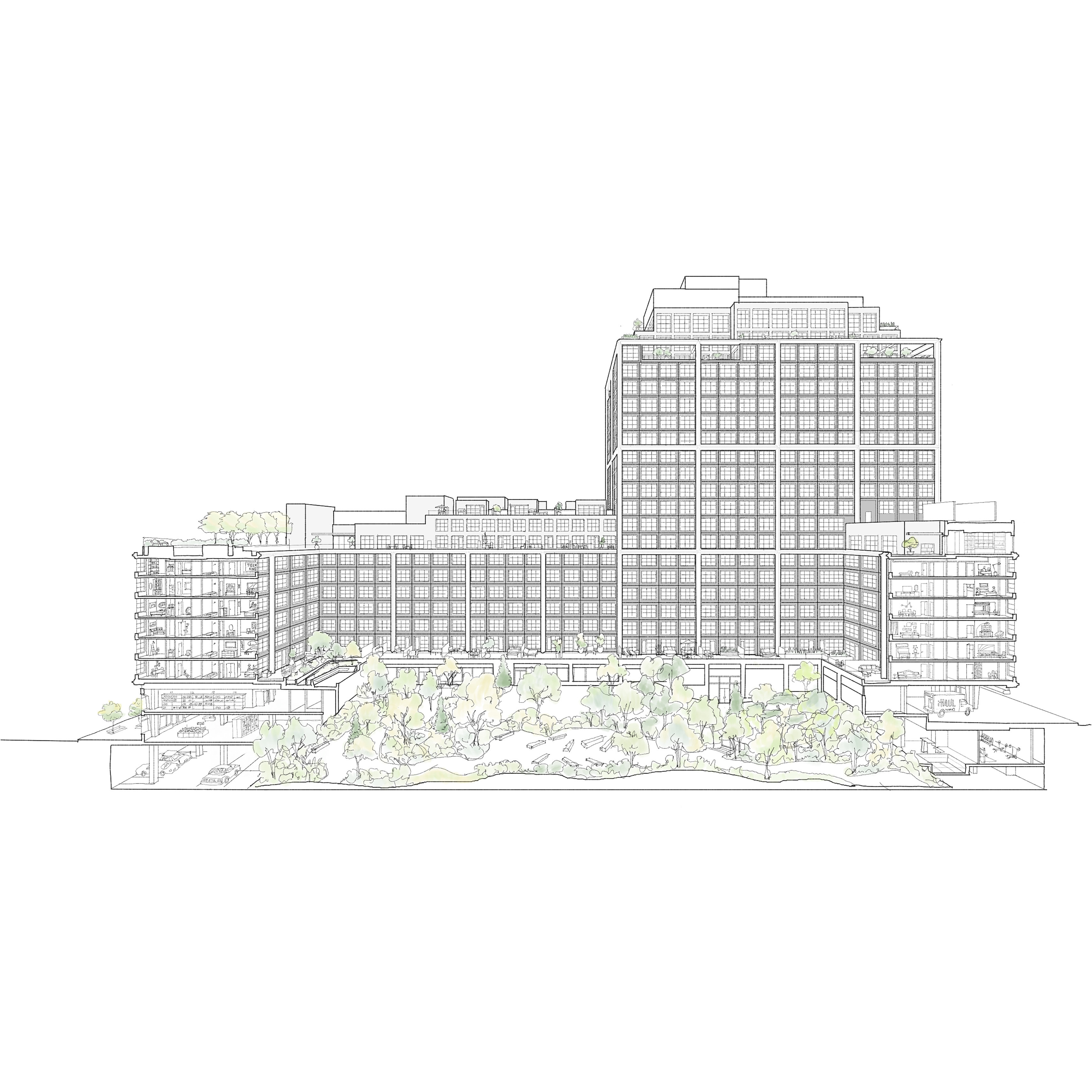
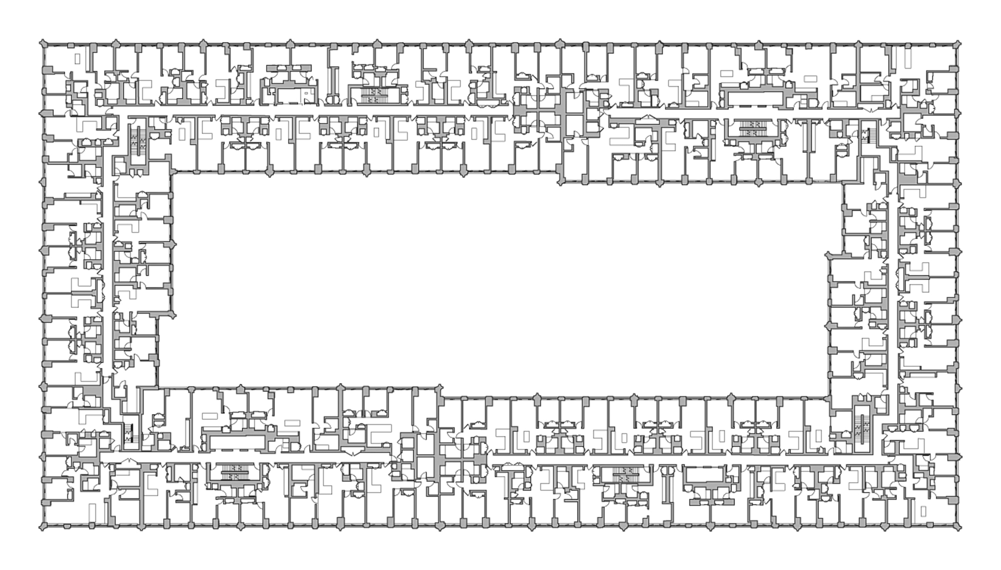
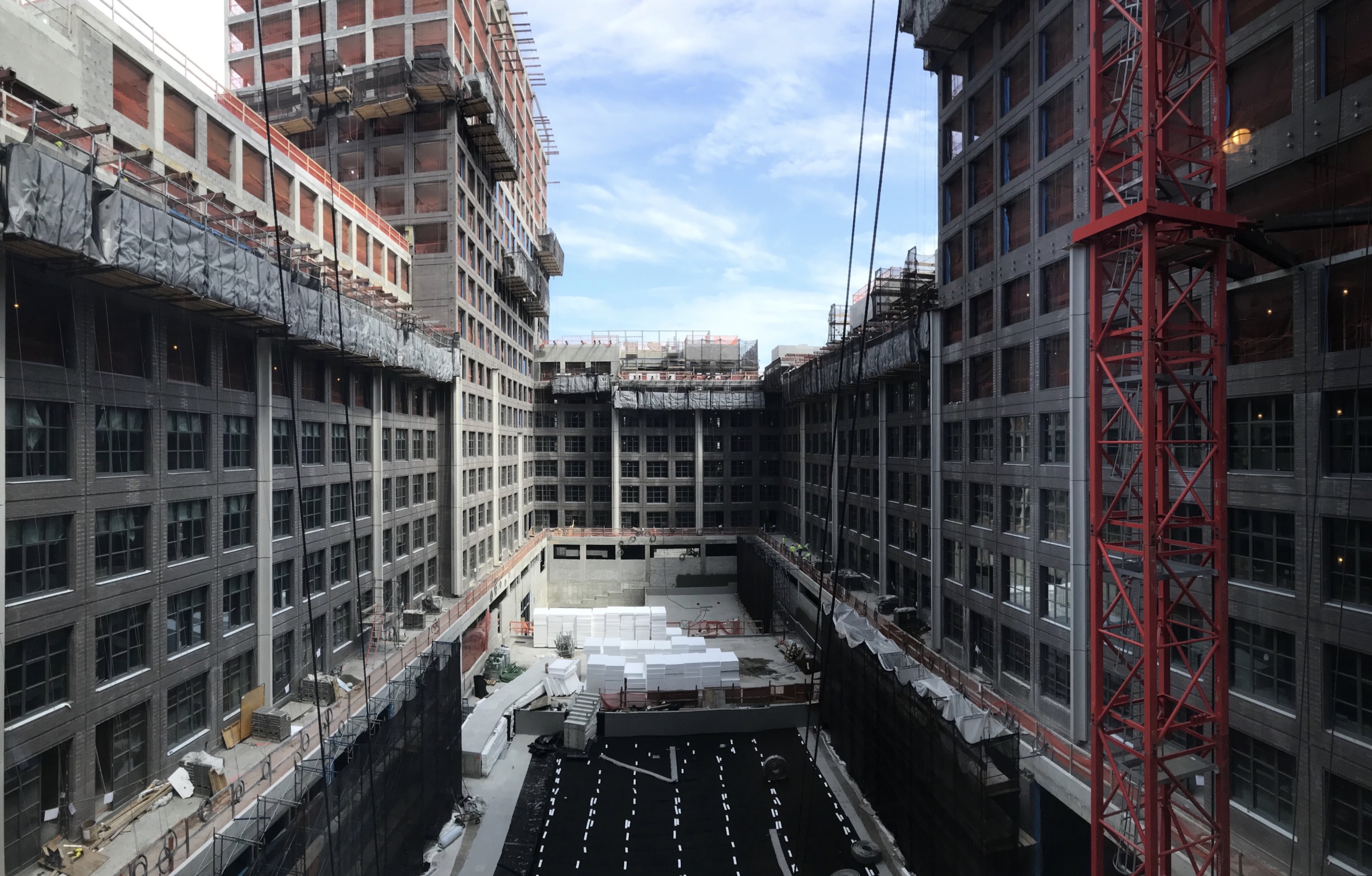
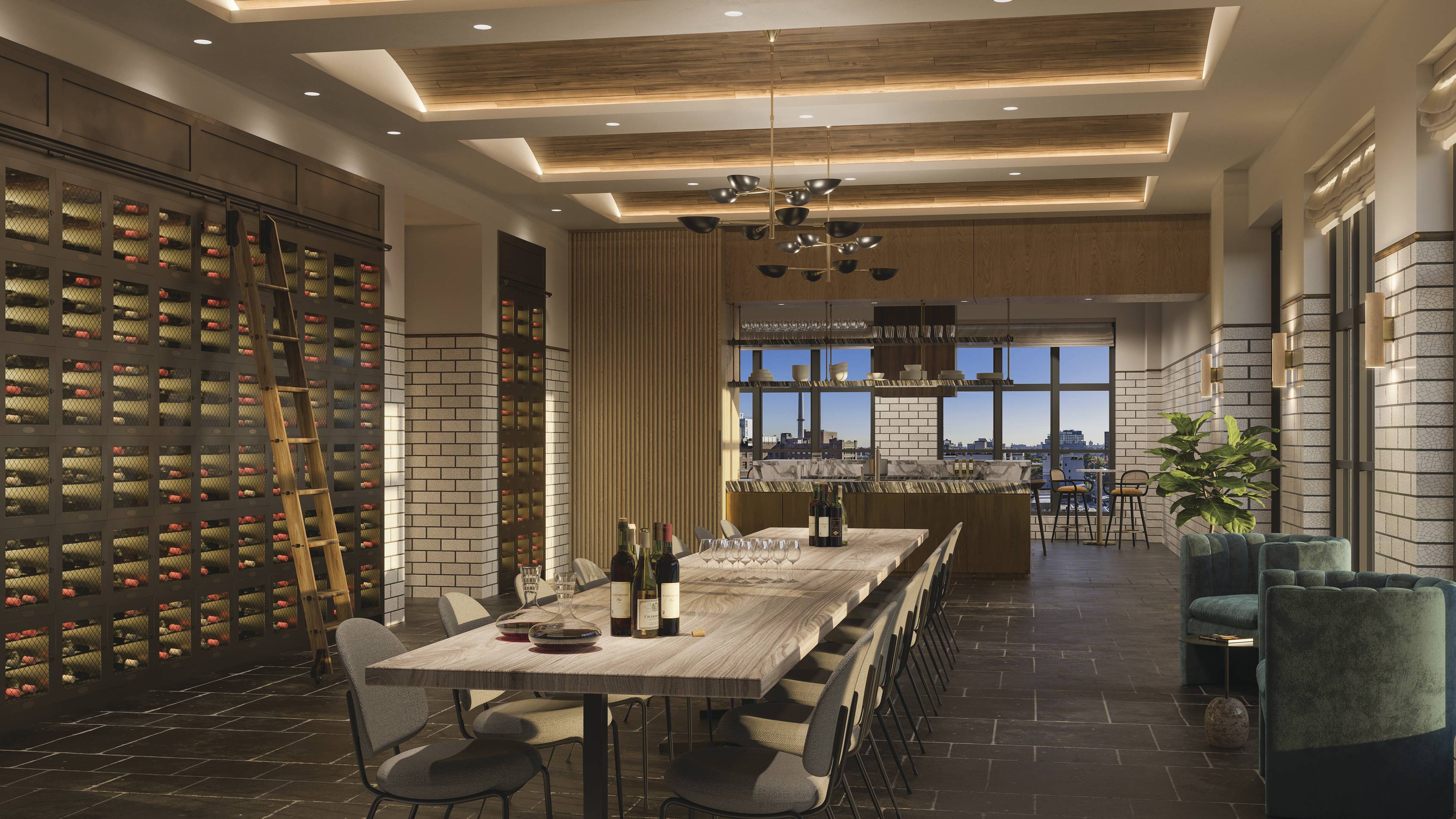
Move #1: Ringing the perimeter of the block with 7 stories of apartments helps to define a private, interior courtyard designed by Michael van Valkenburgh. At opposite corners of the block, two 21-story condominium towers rise from being engaged with the adjacent, 7-story rental. This optimizies views and alternates the towers in the urban composition with an unassocaited, nearby tower. Indoor and outdoor amenities sit atop the 7 story rental portions, providing views down into the courtyard and over to the Brooklyn and Manhattan skylines.
In plan, we kept the perimeter strictly rectangular and expressed the differing depths of the uses on the interior of the courtyard.
Force: Private courtyard
![]()
Move #2: A 20 ft setback on all sides gives a generous public space at ground level, which lacks implied directionality, and allows for the towers to rise to their penthouses without setback, sidestepping the typical move in the city of wedding cake-ing. The residential floors begin with a cantilever that is connected to the ground by angled columns. This move balances the tension of the differing expressions of the differing programs of retail and residential.
Forces: Generous public sidewalk and expression of differing uses.

Move #3: The pixelation of the penthouse setbacks give a top adhering to the traditional tripartite anatomy of a skyscraper, relating to the skyline of Brooklyn and the city a
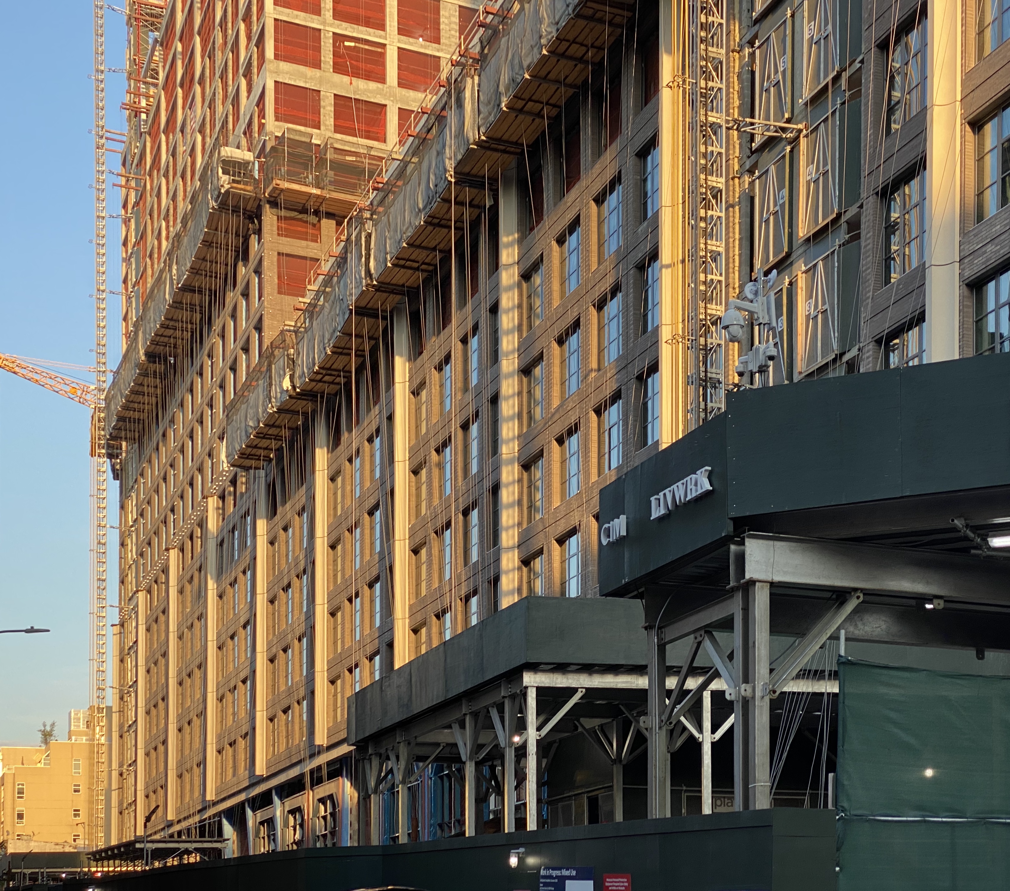
t large. The penthouses burst out of the mass above the primary grid, by introducing a singular logic of structure and separate materiality; both in line and combating the rigid organizing principles of the rest of the building. The brick is of a distinctly lighter shade of gray so as to reinforce it’s difference through a lighter touch.
The setbacks also allow for luxuriously shallower units and significant terraces with areas in the range of 100-1000 SF.
I have labored over every facet of these setbacks from the plumbing leaders through slab drops to the window designs to the gas grills to the paving design the free spanning superframe. Force: Traditional tripartite tower composition
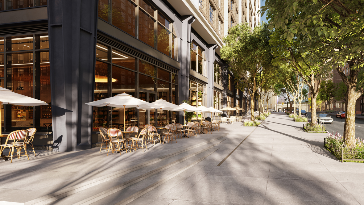
Move #4: The retail storefront arches and expressive sloped column covers of the ground floor temper the hard datum of the first residential floor with the dramatically sloping sidewalk. Made from curtain wall construction, the expressive design is spread across 56 uniquely dimensioned aluminum arches ranging in height from 12’ to 35’.
I mocked-up the components of this facade many times at full scale in foam to really nail the sizes and relationships of the components. This experience rewarded the love of iteration that was placed in me during my undergraduate studies at the Fay Jones School of Architecture. Force: The nearby Manhattan Bridge

Move #5: A 3’ wide glass fiber reinforced concrete (GFRC) exoskeleton traces the structure beyond the brick and breaks down the relentless 460-ft and 240-ft long facades. It breaks up the mass into something more digestible and in-scale with the surrounding neighborhood: bays of 3 and 4 windows wide.
This “superframe” - as we call it at the office - acts as a regulating device for the perception of the building mass. Force: Neighborhood rhythms
A series of small and medium scale moves put the details in relation to the charming former industrial residential neighborhood.
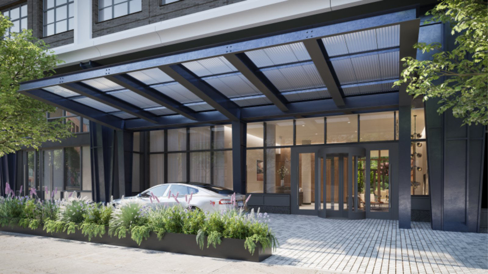
Occupying the sidewalk became a priority, and so a collection of entry canopies, landscape elements and a large ampersand sculpture dot the setback public plaza. These elements help the user occupy the space through the intimate scale. Move #6: The 4 residential entries are identified by expressive steel canopies made from a combination of built-up sections and standard ones. The gentle leaning of the angled geometry gives evidence to the hand-drawn quality of the design process. A custom glass frit will reference recycled corrugated glass often found in industrial buildings in the city. The light let through its gentle gradients will soften the intensity of the steel.
Designed primarily with my supervisor, I crafted something aggressive in shape and size but detailed with elegant intricacy. Working with exposed steel was an absolute pleasure as it contrasts so greatly with the faux flanged expressions of the aluminum storefronts. Forces: Symbol of entry, intimate scale of sidewalk experience.

Move #7: Landscape elements sited casually around the site will contrast with the domineering architecture of the rigorous storefront. Occasionally, a double allee of trees will spring from planters in the sidewalk. The layout of these elements further spreads and expresses the generous the sidewalk experience. A series of rough-hewn stone bollards will also act as indication of the condo drop-offs. Force: Intimate scale of sidewalk experience
Move #8: A large-scale sidewalk sculpture will add a moment of play to the primary corner. A gently sloping sidewalk stair will act as a pedestal and work to establish a ground for the sculpture. This urban artifact - to borrow from Aldo Rossi - will act as a point of reference in the urban composition. Standing at 12’ tall and 10’ wide, it will pull the gravitational center of the intersection onto our site. The ampersand has been designed in-house by our art services team. I designed the minimal podium where the sculpture rests on the first step down from the retail level. Below is the plan of the corner along with a matrix of design studies for the composition. Force: Urban artifact
Move #9: The hand-laid brick sits in stark contrast with other facade elements. Lines are drawn across the facade with brick reveals where expansion joints - required by contemporary construction - are hidden. Surrounding each window is an additional brick surround. The brick piers get smaller at each 7-story tier defined by the superframe. The details at left explain the progression of smaller piers and thus larger windows. This straightforward but intricate brickwork is the best evidence of the hand in the entire construction.
As an element in the balance of the project’s expression, the articulation of the GFRC exoskeleton lends the project a precise crispness that gives a conceptual reading to the organizing principles. The superframe also acts to extend the depth of the facade to a luxurious 2’ 2” (where it would be merely 8” otherwise).
I obsessed on the design, documentation, review of shop drawings, and site observation as we reigned in the quality of these details. Forces: Neighborhood textures and facade depth


photos and drawings by Kent Johnson
renderings by Williams New York